
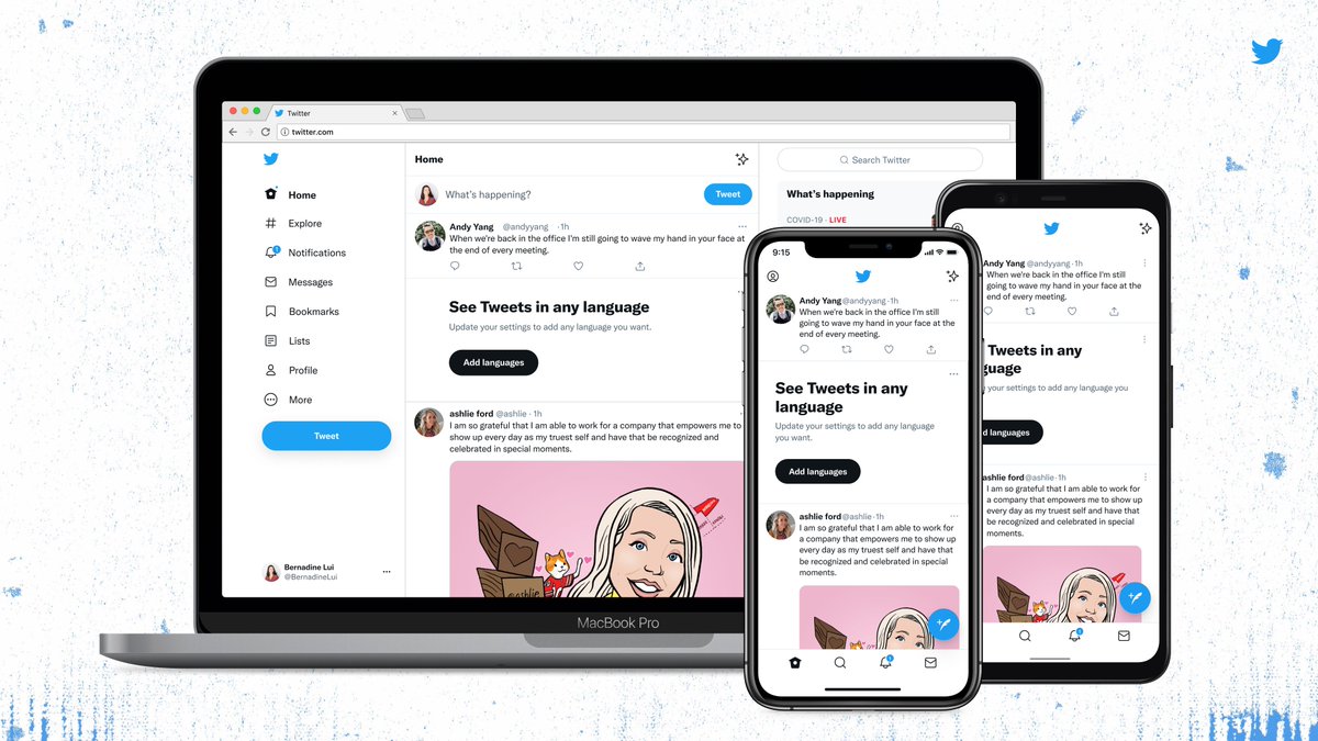
Are you seeing something new when you open up your Twitter app? Twitter recently redesigns its visual elements. Before such an update, Twitter upgraded its Tweetdeck version. It also enabled 4k images, full image display, and images with no margins.
First, Twitter uses a new text format called “Chirp” fonts. The letters are thinner impacting text presentation on feeds. All Western languages text will also be aligned left on the feeds. While Non-Wester languages remain in the same position.
Twitter also adopts a new in-app color scheme with a lot less blue hue. The change in the color scheme aims to draw more attention to the photos and videos.
The platform is also experimenting with images that take up a horizontal space in-stream. The platform currently eliminates the rounded border on an image.
Last, the platform has realigned its in-app buttons and removed the dark gray backgrounds to de-clutter the display.
Twitter redesigns its visual elements on 11 August 2021.
Implications for Marketers:
Twitter’s redesigned visual elements make things more accessible and focused within the platform. For marketers, highlighting images and videos more makes their ads more eye-catching. While easier-to-read text can help them convey their campaign messages better.
Reference: https://twitter.com/twitterdesign/status/1425505308563099650?s=21